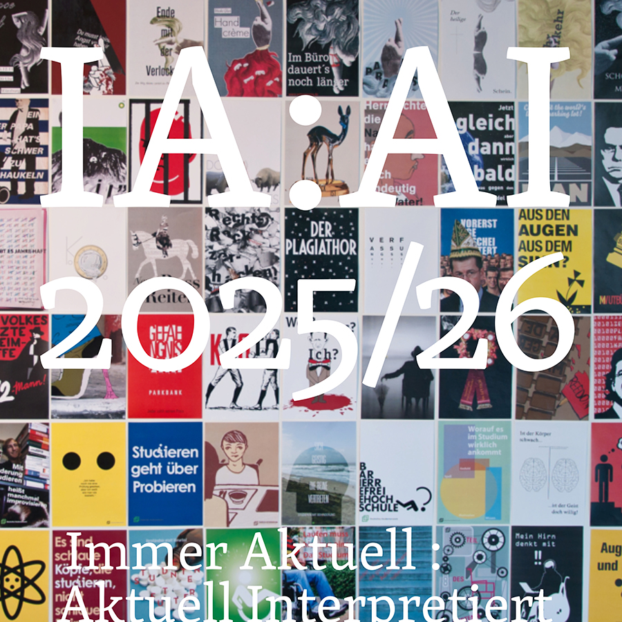
I A : A I Always up to date : Currently interpreted : special
Political Poszters Always up to date : Currently interpreted : special
Posters & workshops & more …
»»» Designers have a great social responsibility; they must take a stand, adopt a position, and be able to communicate such and other types of content visually and quickly.
We must be more than just “problem solvers for tasks” (which is actually impossible); we must stand by society: take a stance, show responsibility, be critical, set the direction, stir things up … This takes training. We do it with the supreme discipline and the most democratic medium: the “P O S T E R .”
IA : AI Always up to date : Currently interpreted : special
»»» Initial informal introductory analyses of what makes a “good” and a “bad” poster.
»»» Lectures on poster designers from the early days to the present day, with role models.
»»» Manual workshop: in which you physically grasp the medium, experience composition, and consciously see and set every detail.
»»» Throughout the semester, the task is as follows: each week, everyone chooses a current topic from politics, culture, society, or economics that is being discussed in public/the media, comments on it, and designs it in a striking way, i.e., conveys it and makes it understandable. We want to try to give the whole thing “body,” something tangible.
DIN A1 and A3 formats (because we will ultimately create a book with full-page illustrations, a chronicle of world events over 3.5 months)
You will become a “pro” in:
how to work with the space available on a poster,
how to find the right text for the headline,
how to attract visual attention,
how a poster is “read”
what makes a good composition for us/the viewer …
In terms of typography, we not only train poster design, but also the finer details. This is done on a side page for each poster, with information on the topic, content, the respective week, quotes, etc.
These weekly poster displays and typographic pages ultimately result in two things:
1. A DIN A3 poster book, bound in hardcover, containing all the course posters. The posters are on the right-hand pages and the corresponding typographic pages are on the left.
2. When displayed side by side, these posters become a huge wall newspaper in our semester exhibition. Visitors can actually read and understand the current topics of the semester visually, not in the daily newspaper, but now in our wall newspaper made up of posters. A “bulletin board,” only in color, so to speak.
Ways of implementing visualization in posters so that the training can be comprehensive:
1. Without a computer = experimental
2. Classic typography (this allows for amazing and tangible variations)
3. Free, according to the student’s/your focus
Introduction
Tuesday, October 7, 2025, 2:15 p.m., I.1.26
Planned excursions:
— Possible combined trip to Essen to visit the Folkwang Museum (William Kentridge) — Düsseldorf K20/K21 (including queer artists of the modern era from 1900 to 1950), Kunstpalast, NRW Forum